Simulating a Bevel Effect Using Stacking

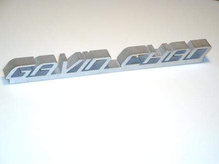
At Big Blue Saw, we occasionally get requests from customers to put a bevel or chamfer on the edge of a waterjet cut sign or control panel.This is usually done for aesthetic purposes, to allow the piece more to show more highlights and shadows.

While we can’t put a bevel on the edges of parts using the waterjet, we can create a similar effect using the stacking technique.

Let’s take a look at how this works with a simple example created in Inkscape. The techniques shown here can be replicated using almost any vector drawing or CAD program.

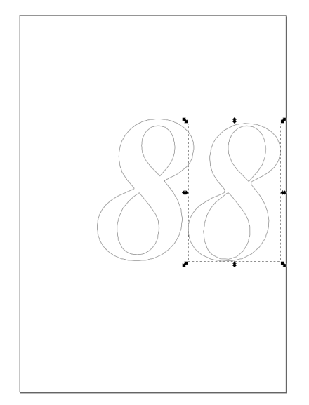
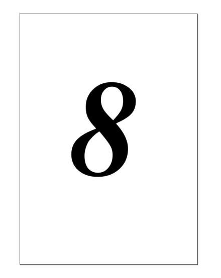
Using the text tool, we will add a number “8” to the drawing.

Selection_114

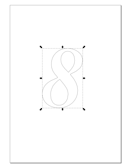
Next we will turn the character “8” into a set of curves by selecting it and choosing Path > Object to Path from the menu. We want to see the curves, so we choose View > Display Mode > Outline from the menu.

Selection_115

We then make a copy of the figure using the Copy and Paste commands.

To make one of the figures into the skinnier upper layer, we use Path > Inset on the menu or Ctrl+( on the keyboard a few times. If you’re doing this, be careful that you don’t make the thin areas too thin to be cut by the waterjet.You can also try making the lower layer larger using Path > Outset or Ctrl+).

Selection_116

If we were going to mount this number using adhesive, we would be done at this point. We could just save the file as a DXF and upload it to Big Blue Saw to be cut.

However, for this example, we will make mounting holes so that the numbers can be mounted with screws or nails.

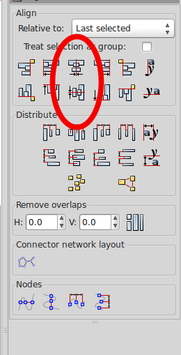
We need to make sure that the mounting holes align on both parts. We select both figures and align them using Object > Align and Distribute on the menu. The shapes need to be aligned both horizontally and vertically using the buttons in the Align panel shown below.

Selection_117

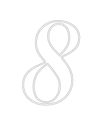
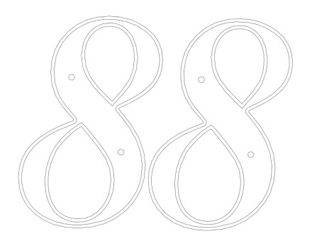
Now the two outlines will look like the figure below. This gives us an idea of how the final parts will appear.

Selection_118

Let’s add a couple circles for mounting holes.

Selection_119

We duplicate the entire drawing using Copy and Paste.

Selection_120

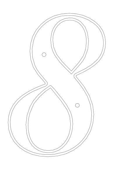
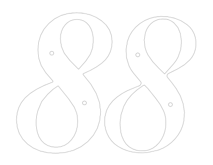
And finally delete the outer outline from one of the copies, and the inner outline from the other copy. Now the drawing has both parts with the mounting holes correctly aligned.

Selection_121

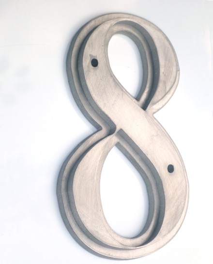
Finally, here are the assembled parts with the simulated bevel waterjet cut from 0.135 inch (3.4 mm) thick stainless steel, ready to be mounted.
 

Numeral 8 With Simulated Bevel


Simplify lettering and signs by using the right font

In the last post on making signs, we saw that it was possible to make a sign with lettering in four different ways.

When you want the sign to be one piece, it can be tedious work to generate all the necessary bridges. This is true both when the letters are positive space (solid material) or negative space (holes). Fortunately, by using the correct font, you can save time and get a result that looks good.
When the letters form positive space, one good choice is to use a script font.
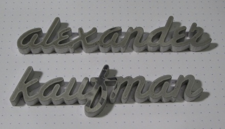
In the example below from David Kaufman, the Santa Fe script font was used to design two nameplates which were then waterjet cut from 1/4 inch thick aluminum. The right hand side of the “f” had to be modified to connect with the “m”, but the rest of the letters naturally run together with this font.

Nameplate signs from David Kaufman

Nameplate signs from David Kaufman

The font used in the examples above: Santa Fe LET http://www.fonts101.com/fonts/view/Script/28879/Santa_Fe_LET

The font used in the examples above: Santa Fe LET


When the letters are negative space, you can use a stencil font. Below are a few examples of the varieties of stencil fonts which might be useful for your project.

 Bodoni Becker Stencil Bold http://www.fonts101.com/fonts/view/Uncategorized/43971/Bodoni_Becker_Stencil_Bold
Bodoni Becker Stencil Bold
Tomorrow People. Note for this font: some numbers and symbols may not have appropriate bridges in this font. http://www.dafont.com/tomorrow-people.font

Tomorrow People. Note for this font: some numbers and symbols may not have appropriate bridges in this font.

Four ways to turn a logo into a sign with waterjet cutting

In the previous post, we took a brief overview of how signs are made using waterjet cutting. In this post, we’ll take a look at four different ways you can make a sign out of a logo.

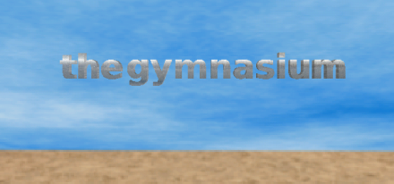
Below is an example logo for “thegymnasium”.

The original logo to be turned into a sign

The original logo to be turned into a sign

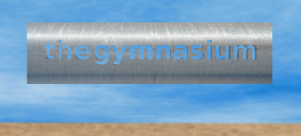
Below you will see renderings of two variations with the logo as positive space, and two variations with the logo as negative space.

A rendering of the sign with the logo as negative space. Note that the centers of the letters "e", "g" and "a" are disconnected parts and must be mounted separately.

A rendering of the sign with the logo as negative space. Note that the centers of the letters “e”, “g” and “a” are disconnected parts and must be mounted separately.

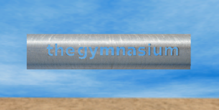
 A sign with the logo as negative space. In this design, the centers of the letters "e', "g" and "a" have been bridged making mounting and alignment easier, but producing a logo that is less faithful to the original.

A sign with the logo as negative space. In this design, the centers of the letters “e’, “g” and “a” have been bridged making mounting and alignment easier, but producing a logo that is less faithful to the original.


The logo with the letters as positive space in the sign. In this variation, the letters have been bridged with a baseline. Note also the bridge connecting the dot above the "i". Since it is one piece, it is relatively easy to install.

The logo with the letters as positive space in the sign. In this variation, the letters have been bridged with a baseline. Note also the bridge connecting the dot above the “i”. Since it is one piece, it is relatively easy to install.

The logo as a sign in positive space with separate pieces for each letter. This would be the most accurate rendition of the logo when installed on a wall or other background of contrasting color. However, it is the most difficult configuration to install, as each letter must be aligned and mounted separately.

The logo as a sign in positive space with separate pieces for each letter. This would be the most accurate rendition of the logo when installed on a wall or other background of contrasting color. However, it is the most difficult configuration to install, as each letter must be aligned and mounted separately.


Creating signs with waterjet cutting (laser, too)

Signs are popular application for both laser and waterjet cutting, as they typically convey their information in two dimensions. Logos, pictures, and lettering can all be cut using the these tools. Most of the signs we make at Big Blue Saw are either stainless steel or aluminum. I prefer the look of stainless steel, its darker color gives it a more solid, serious look. Signs can be made from very thin material, but for more visual impact close up, you can go with a thicker stock.

There are generally two approaches to cutting a sign or logo:

  1. Making the individual letters out of solid material and assembling them together.

  2. Cutting the lettering or design from within a solid outer frame.

In other words, you must decide whether you want the design to appear as positive space (material) or negative space (holes).

The second approach can result in a sign that’s easier to install. If designed correctly, you can hang up the sign as a single piece without having to worry about fastening separate letters or their alignment. In order to do this, you must be sure to join any separate islands within the design with bridges. This often comes up when adding certain letters that naturaly contain islands: A, B, D, O, etc. Note the bridging on the letters in the sign shown below.

This sign was easy to assemble, with just a few screws needed to hold the upper layer onto the lower layer, and 4 screw holes in the corners to allow the sign to be hung up.

A sign in two layers, with the logo and lettering waterjet cut from wood.

A sign in two layers, with the logo and lettering waterjet cut from wood.

If you want the letters to be made from solid material rather than holes, you can still keep them in one piece, but you will have to come up with a scheme for joining them together. The photo below shows one possible approach.

Note also that this sign is designed to be cut in a single pass with only one pierce of the material.

A nameplate sign with the letters as positive space and joined together.

A nameplate sign with the letters as positive space and joined together.


If you want the most accurate representation of a logo, you will probably choose to have each section of the design and each letter cut out as separate pieces. This allows, for example, letters to be exactly the shapes you want them to be without having to worry about bridging. Since you don’t have to worry about designing bridges or connecting elements of the logo, design can be easier. The chief downside of this kind of sign is that each piece must be hung separately. You must also take great care when installing the sign to make sure that the position and alignment of each piece is correct.

When designing a sign, you should consider how the sign is to be hung on a wall or otherwise mounted in place. If you are mounting to a wall or other flat surface, can include holes for mounting screws in each pieces of the sign. If you don’t want visible screws, you can mount the sign using adhesive, or by welding attachment points to the back. Make sure that whatever attachment method you use is strong enough to hold up the sign (Big Blue Saw gives you a weight estimate for your design in the ordering process.)